


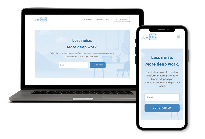
QuietInbox is a conceptual content platform I designed to help remote teams improve focus through asynchronous communication. Inspired by the ever-growing fatigue around back-to-back meetings, the goal was to create a calming digital space, blending a minimalist visual language with purposeful content design.
The result: a website that feels like a breath of fresh air in the cluttered world of team productivity tools.
Remote work promised flexibility but often delivered burnout. Teams overloaded with notifications, unnecessary meetings, and poor documentation habits needed more than another SaaS tool. They needed guidance — a platform that teaches better habits, not just sells them.
So I asked myself:What if there was a space that didn’t sell urgency, but taught clarity and calmness?
Conceptual Case Study
UX/UI Designer | Webflow Developer
Figma, Webflow
I studied async communication principles from real-life companies like Basecamp, Doist, and Notion. I took cues from their product philosophies and content tone.
I mapped out:
I wanted QuietInbox to look like how it feels to read in a quiet library.
So I chose:
I started in Figma with simple wireframes to define:
Then I translated them into a polished UI:
Instead of coding from scratch, I chose Webflow to:I wanted QuietInbox to look like how it feels to read in a quiet library.
QuietInbox isn’t just a pretty landing page — it’s a design philosophy. I challenged myself to go beyond UI and deliver a feeling: that silence can be productive, too.
If a client is looking for a designer who can think deeply, design intentionally, and align visuals with values — this project is my answer.


Practical UI/UX insights for Shopify and ecommerce brands looking to improve conversions, usability, and trust through better design decisions.